By Christine Cura
Color is one of the most powerful tools in home design — and one of the most underestimated. The right palette doesn't just make a room look good. It shapes how the space feels to everyone who spends time in it. In Hunterdon County, where homes range from historic farmhouses in Delaware Township to newer construction in Branchburg, thoughtful color choices can completely transform a room without replacing a single piece of furniture or adding a single fixture.
Key Takeaways
- Color directly affects mood, energy, and how comfortable a space feels to both residents and visitors
- Different rooms benefit from different color approaches based on how they're used
- You don't need a full repaint to apply color psychology — accent walls, soft furnishings, and decor all carry color effectively
- The 60-30-10 rule gives you a reliable framework for building any color palette
How Color Affects the Way a Room Feels
Color psychology is the study of how colors influence human emotion and behavior. In interior design, it's the practice of choosing colors intentionally — based on how you want a room to feel, not just how you want it to look. The two are related but not the same, and the distinction matters when you're living in a space every day.
Cool tones — blues, greens, soft grays — tend to calm the nervous system and create a sense of quiet and ease. Warm tones — yellows, oranges, terracottas — energize a space and make it feel social and inviting. Neutrals anchor a room and allow other design elements to carry the character. Understanding which effect you want from each room in your Hunterdon County home is the starting point for any color decision.
Cool tones — blues, greens, soft grays — tend to calm the nervous system and create a sense of quiet and ease. Warm tones — yellows, oranges, terracottas — energize a space and make it feel social and inviting. Neutrals anchor a room and allow other design elements to carry the character. Understanding which effect you want from each room in your Hunterdon County home is the starting point for any color decision.
The Emotional Range of Common Interior Colors
- Blue: Widely considered the most calming color in interior design. Soft, muted blues work well in bedrooms and bathrooms, where relaxation is the goal. Deeper navy tones bring sophistication to dining rooms and studies.
- Green: Associated with nature and balance. Sage and soft olive tones have become among the most popular choices in residential design for their ability to feel both fresh and grounding — a natural fit for Hunterdon County homes surrounded by countryside.
- Yellow: A natural mood-lifter that reflects light and adds warmth. Works well in kitchens, breakfast nooks, and entryways where an energizing, welcoming tone is appropriate. Use it with restraint — the eye notices yellow before other colors.
- White and off-white: The most versatile of all choices. Reflects light, makes rooms feel larger, and lets architectural details and furnishings speak for themselves. A reliable base for any style from farmhouse to contemporary.
Matching Color to Room Function
The most effective application of color psychology in home design matches color choices to how a room is actually used. A bedroom and a home office serve completely different purposes, and the colors that support those purposes are different too.
In Hunterdon County's residential market, many homes include formal dining rooms, dedicated studies, and mudrooms connecting to active outdoor lifestyles. A thoughtful color approach reinforces each space's purpose in a way that makes it more enjoyable to use every day.
In Hunterdon County's residential market, many homes include formal dining rooms, dedicated studies, and mudrooms connecting to active outdoor lifestyles. A thoughtful color approach reinforces each space's purpose in a way that makes it more enjoyable to use every day.
Color Recommendations by Room
- Bedroom: Soft blues, sage greens, warm whites, and muted lavenders support rest and recovery. Avoid high-saturation, energizing colors on bedroom walls — save those for accent pillows or artwork where their impact is more controlled.
- Kitchen and dining areas: Warm tones — terracotta, warm white, soft yellow, earthy red accents — make food feel more appealing and encourage lingering at the table. These spaces benefit from colors that feel social and alive.
- Home office: Soft greens and muted blues support focus without creating fatigue. Avoid stark white, which can feel clinical over long hours, and high-energy reds or oranges, which can increase stress in a work context.
- Living room: The most flexible space in the home. Warm neutrals, deep greens, and layered tones that mix cool and warm work well here. The living room is where color choices can be bolder without the stakes being as high as in a bedroom.
How to Apply Color Psychology Without a Full Repaint
You don't need to paint every room to use color psychology effectively. Strategic application through furniture, soft furnishings, and accent walls can shift the feel of a space without the commitment of a full repaint.
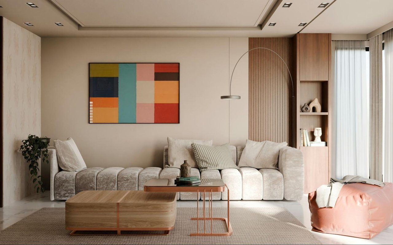
The 60-30-10 rule provides a practical framework: 60 percent dominant tone (walls), 30 percent secondary tone (furniture and textiles), 10 percent accent color (artwork, cushions, decor). When balanced, a room feels cohesive rather than flat or chaotic — and you can shift its character significantly just by changing what sits in that 10 percent layer.
The 60-30-10 rule provides a practical framework: 60 percent dominant tone (walls), 30 percent secondary tone (furniture and textiles), 10 percent accent color (artwork, cushions, decor). When balanced, a room feels cohesive rather than flat or chaotic — and you can shift its character significantly just by changing what sits in that 10 percent layer.
Low-Commitment Ways to Introduce Color
- Accent walls: One wall painted in a deeper or more saturated tone can transform a room's energy without overwhelming it. This works especially well in living rooms and dining rooms where a single focal wall anchors the space.
- Soft furnishings: Throw pillows, area rugs, curtains, and blankets are the easiest way to test a color in a room before committing. They're also the easiest to change when your preferences evolve.
- Art and decor: Colorful prints, framed artwork, and decorative objects reinforce a color story without adding it to the walls. A gallery wall with warm-toned pieces shifts the feeling of a neutral room significantly.
- Painted furniture: A single piece — a bookcase, a console table, a set of kitchen chairs — painted in a bold or unexpected color can define a room's personality without requiring any structural change.
Frequently Asked Questions
What colors work best in Hunterdon County homes with a farmhouse or historic aesthetic?
Warm whites, sage greens, deep navy, and earthy neutrals all complement the architectural character common in Hunterdon County's older homes. These tones feel grounded, timeless, and consistent with the county's rural landscape without feeling dated.
How do I choose between warm and cool tones for my home?
Start with how you want each room to feel. If rest and calm are the goal, lean cool. If energy and sociability are the goal, lean warm. The existing light in each room also matters — a north-facing room with limited natural light benefits from warm tones that compensate for the cool quality of northern light.
Can color choices affect how my home shows to buyers?
Yes. Neutral, well-chosen color palettes consistently perform better with buyers than bold or highly personalized choices. Light, airy tones make rooms feel larger and more move-in ready. If you're preparing a Hunterdon County home for sale, a fresh coat of warm white or soft gray is one of the highest-ROI investments you can make.
Ready to Make Your Home Feel Like You?
Color is one of the simplest and most affordable ways to transform how your home feels every day. Reach out to me, Christine Cura, whether you're updating your current Hunterdon County home or searching for a new one that feels right from the first room.